Channels
In-App Push messages: the ultimate guide
The ideal format for influencing your users whilst they are browsing the app. All an app’s users can see In-App Push messages, whether they have opted in or out of Push notifications. Find out how to make them work for you!

What are In-App messages?
In-App messages are messages you display directly to your customers from within the app.
They can be triggered when users open the app or perform a specific action - in this case we refer to trigger scenarios:
Going to a page
Clicking a button
Creating an account
Etc.
Notes
Note: these In-App messages can be triggered even if users have not activated Push notifications!
- 100% native formats in our technology choices
- 100% of your audience is addressable
The advantages of In-App messages
Make the most of every time your customers are using the app.
Create a unique customer experience.
Use automated messages.
Boost engagement.
“Currently, In-App messages are pretty well integrated. They are well known and we therefore use them to prevent Opt-Outs. We also use them for customer surveys, which works really well, in addition to the email component. We even use them in retention cycles. These are just some of the things we launched with In-App messages, and they are working really well.”
How do mobile landing pages and In-App campaigns differ?
In-App campaigns and mobile landing pages appear the same - but they have very different goals!
In-App campagin
Appears further to user In-App action.
Is launched via a Trigger defined when creating the campaign.
Mobile Landing Page
Always associated with an App Push notification.
Appears after opening this App Push notification.
Case study: how can you make In-App messages effective?
To achieve results, you can't make up an In-App campaign as you go along: it has to contain targeting conditions, a Trigger that will display the message in the app and the message itself to be received by the user.
Step 1: determine your targeting and your Trigger
What portion of your audience do you want to reach? Specify your targeting conditions in the tool so the message is sent to the right people. All options are available: customers who already purchased a specific product, customers who have never made a purchase, and so on.
You just have to find the right Trigger: when should the message appear?
when the user opens a new session,
as soon as possible, when the SDK receives information on the In-App campaign, a user reads an article or fills out a form to complete an order.
Need help?
We answer your questions.

Step 2: select the format of your In-App message
Fullscreen format
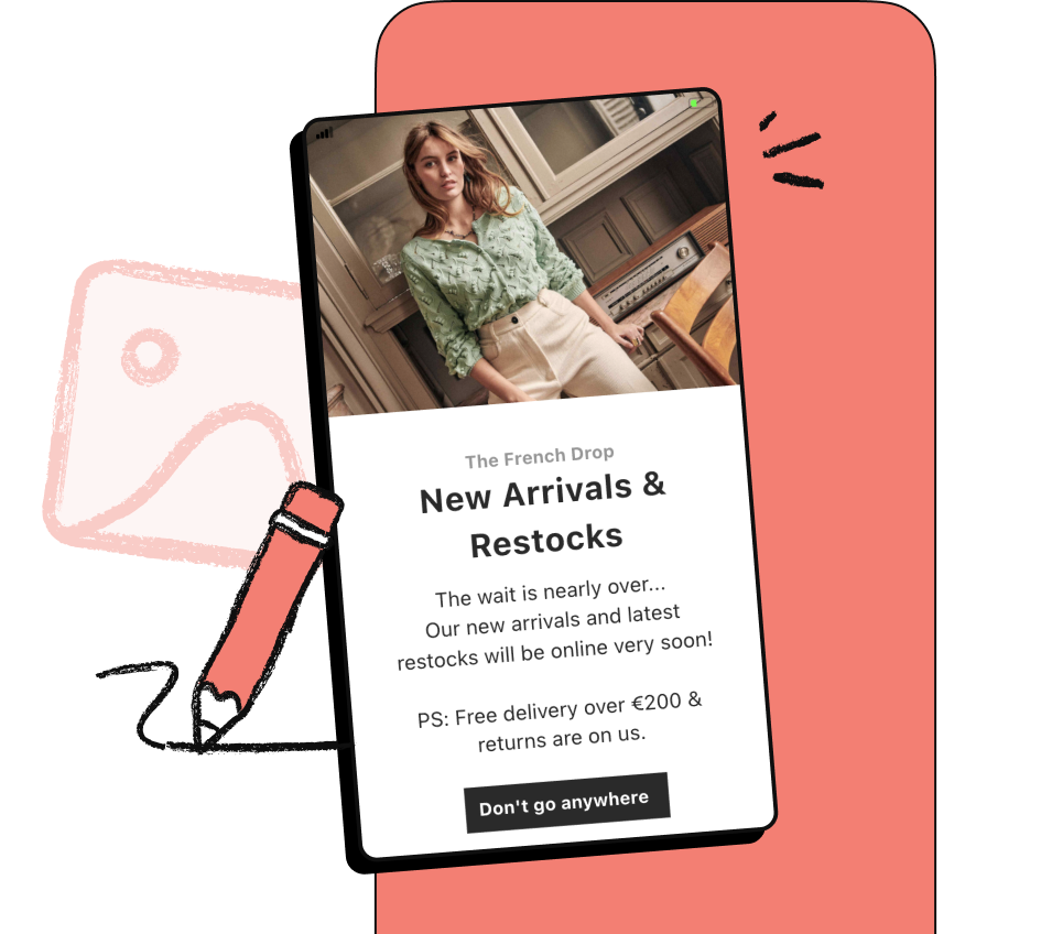
This format can contain text, an image, no more than two buttons and a close button. It is practical for showcasing your products, marketing your special offers, encouraging updates or sharing the app!
Banner format
A banner, appearing at the top or bottom of the screen, can contain text, two buttons and a close button, but also an automatic deactivation timer (10 seconds by default). This format is ideal for encouraging the use of features, proposing notifications and informing users.
Image format
This format displays an image, sometimes with a modal, in full screen or with a screen overlay. Regardless of duration, background colour or the automatic closure option, the app remains visible in the background.
Step 3: customise your campaign message
Messages sent in the app must be well-conceived to be effective. Batch’s technology enables the use of customisable formats that suit your design, offering every user a pleasant experience and creating better interaction.
Use the right templates to customise your message with text, a call to action and an image
“30% of our Push notification opt-ins did not Opt-In to our emails. This really shows that push notifications help us win new customers and easily communicate with them.”
Step 4: analyse your campaign
An In-App campaign’s success doesn't lie solely in its creation: you also have to understand its results and analyse message performance.
Key performance indicators
Sent: total number of Push notifications sent, updated every minute.
Open rate: percentage of users who clicked on the Push notification (direct open) or opened the app within 3 hours of receiving the Push notification (influenced open).

Get a Demo.
Connect with us & try Batch for free.
Mention LégalesCopyright Batch © 2026